Quantcast
Channel: The Art of Fantasio
Viewing all 188 articles
Browse latest View live

Draw Facts Or Feelings Or Nothing At All

$
0
0
When studying the old and modern masters, it is wonderful to learn how to do a stroke to achieve that grass or that lighting, however, the really interesting aspect for me is always to learn what led to which decisions.
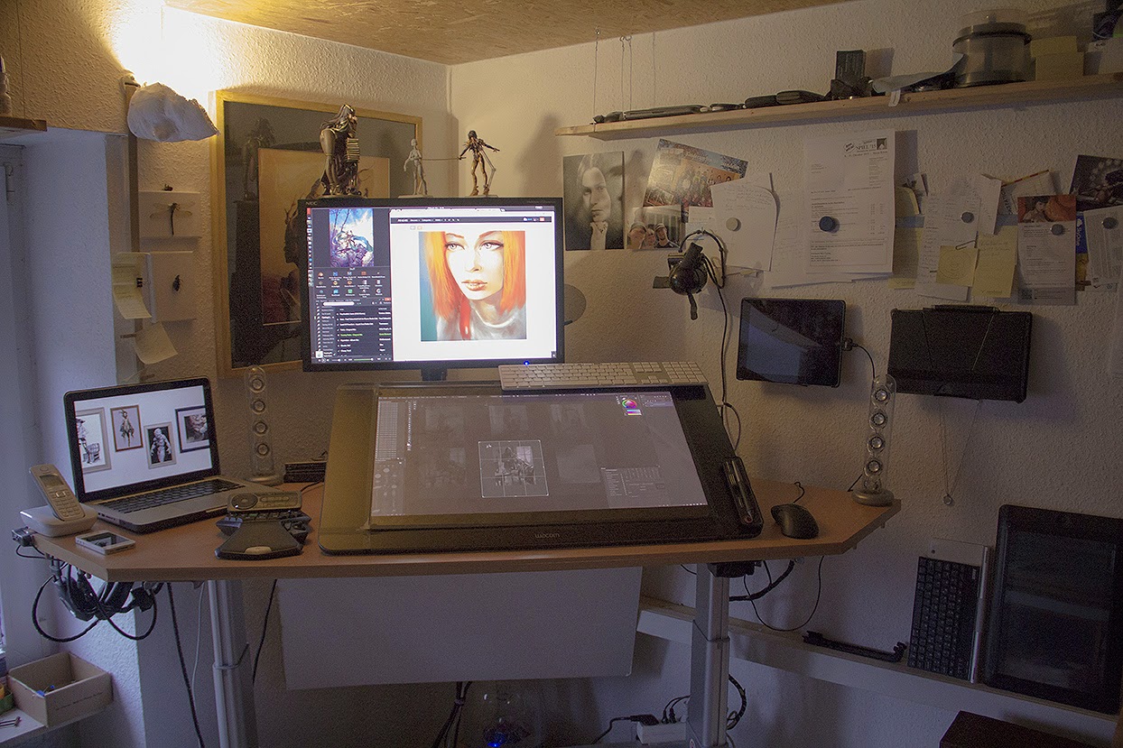
Feeling evoked through pose and colors.

Like the Ishioka Benchmark, I suppose many artists have a set of rules they work with, the common known is the golden cut or spiral. My personal set of rules has with facts/feelings a new register and I thought I share what I know about it.

"This post is about how to skip halfhearted approaches to art and why it is better to have a set of rules instead of a facebook group to help you with critique."


It does not work like a drawer where you put something in order to categorize art, this is simply not possible.

What I often observe is that there is actually no need for realism aka facts in artworks. Most successful artists make up with feelings what they can´t back up with facts.
And if you think about it, this holds truth; realism is all about technique. But technique is nothing you will be paid for as an artist, neither in fine arts nor in illustration.

I practice this by watching artworks this way:" does this look like fact or is it feeling?" You´ll be surprised how many artworks you will find in your favorite art books that skip the facts!

It is nothing against realism, before photography was evolved it was the only way to depict reality. From what I have learned, it is the best to put feelings first in an artwork and then back it up with facts as much as possible. They both can work well together.

An example; an appearance of a character is per se shallow, adding details that are personal and authentic make them come alive, regardless of how strong the rendering is.

That is the reason so many cyborg renditions are *pardon* dispensable, as they can´t reflect reality but also lack emotion and that is why these works don´t resonate.

For a Photoshop workshop this might be still considered OK you think, but people don't buy what you do, they buy why you do it. Simon Sinek 
Which leads me to the conclusion that if you do it because of the technique, they buy it because of the technique and that reduces you as an artist to a technician, which is a waste in my opinion.

That pushes me to the viewer side, the other end of the art and this part is so often overlooked it makes me cringe.
A viewer does not need a benchmark, they view a work and in a split second they decide if they like it or not. As artists, I believe it is our serious mission to be clear about what we do and how others perceive it. There should not be room for a tiny misinterpretation.

Feedback for this is essential and in the process of getting constructive feedback I have seen so many people fail, it is hilarious - at the head my own humble attempts of course.

One thing beforehand: The place you pick for feedback will shape your body of work.

In the following I explain why a set of rules and benchmarks is better than your "inner circle", facebook group, client or spouse.

When I mean facebook group I mean those places like Level-Up or the likes, it is ridiculous to think you can reach someone there and if you do, you get so many different pointers that you wish you had never asked. Or you are already good enough that you actually level-up on your own set of rules. And of course there are groups where you get overpaintings and critique you have never asked for, true story.

An inner circle is fine, you work with your buddies in a collective studio, even better. But they will not replace a benchmark or your own set of rules once you go solo. You will always be dependent on peers.

A client knows (most of the time) none of your business, he or she loves your work and don´t care about technique as long as the result is authentically yours. He/she has a few spots for requests in every commission and has the generous seat in the front row. You can ask what a client thinks but only put it in consideration, the more you grant every wish, the less authentic the artwork will be.

Real friends, spouse, wife and family, they all have something to say and are eager to know what you are working on. Sometimes they see little things you don´t even notice and that is good, but if your wife is also an artist, then you need to decide if you rather like to discuss or if you want the work to get done.

Are You An Institution Or A Household Name?

$
0
0
It astounds me every so often that people, experts and beginners alike decide to become institutions instead of a household name.

Where´s the difference?

In the dictionary there is not much of a difference between institution and a household name, the discrepancy is in the public perception.

An institution, when associated with a person, is very often someone well known, you know they are there and you know their name, but that´s it. Just like any other institution such as universities -you know they are there, but you always wonder how they work.

A household name is someone like Tim Burton, in terms of brand it is possibly Kitchen Aid, you know you don´t need those every day but if you have to think of a brand that help you with what you intend to do - a household name is what comes first to mind.

Just like these brands or institutions we can shape our personality to be perceived in a similar way.

An example is the print-shop I visited the other week to get a canvas print faster than I would if I order online. The shop used to sell them readily prepared on stretcher, however I can do that myself and asked for a print without framing - they couldn´t readily name a price but a guessed number that was less than half of what mounted on stretcher would cost. When I wanted to pick up the final print, I figured they forgot to leave enough canvas to wrap it. WTF, just because I don´t want it wrapped doesn´t imply I don´t need it ready to be wrapped. Also I would have taken the wrong version and could have imagined to mount it on a wooden ground framed and so on, but they threw it away before I could even ask about it.

This is a perfect example of institutionalisation! First thing: they could have saved money and time by asking and being sincerely interested in what the client want. Secondly: They could cut costs by offering the first wrong print to a reduced price.

That is essentially what institutionalisation does, you can´t keep track of what is important to you. A fixed income and working time from 9 to 5 is more important than happy customers. If that is you, become a household name.

People with a household name, such as Brom, Tim Burton or Hans Zimmer are in demand because of their passion for what they do. They can only become better because every project they get offered is targeting the direction they want to go anyways.

As institution, you never get this far.


Oni Ni Tenome

$
0
0

Full view is beauty!

“Hide your face forever
dream and search forever
Open your eyes, open your mind
proud like a god don’t pretend to be blind
trapped in yourself, break out instead
beat the machine that works in your head”
Lyrics from Guano Apes

Personal work for the Dark Realm Collective, follow us on:
http://fb.com/darkrealmcollective
&
http://darkrealmcollective.tumblr.com

The themes for this Halloween were:

1. The Resurrection of the Buckners
2. A Symphony of skulls
3. Hollywood Macabre
4. I can’t shake these Daemons
5. The Apparition of Lady Grey

I decided to go with the Demons I can´t shake.
The Tenome is a mythological Japanese creature best known from the movie Pan´s Labyrinth. Del Torro´s vision nailed the creature
perfectly as it used to be a blind man. However I took the artistic license to run wild with the interpretation.

So I can´t shake these demons in the widest sense possible.

On another note there are artistic demons that are a huge influence, for once it is obviously NekroXIII, Android-Jones and Michael Parkes
At least I can point them out;)

Another thing that was very interesting in this piece was the clash of different styles which I learned in the past such as the cyborg  creation, the android style and the use of Mandelbulb3D for the layered look in the background. I love to combine possible and impossible things, this was such a big fun.

Hope you like and enjoy the rest of the release from the Dark Realms Collective

Mercury Rising

$
0
0


About this piece:
Mercury, Latin: Mercurius is a major Roman god, being one of the Dii Consentes within the ancient Roman pantheon. He is the patron god of financial gain, commerce, eloquence (and thus poetry), messages/communication (including divination), travelers, boundaries, luck, trickery and thieves; he is also the guide of souls to the underworld. Mercury had essentially the same aspects as Hermes, wearing winged shoes (talaria) and a winged hat (petasos), and carrying the caduceus, a herald's staff with two entwined snakes that was Apollo's gift to Hermes.

This is a personal work., resoures used from Fotolia and my own archives and fractals rendered in Mandelbulb3d. Photoshop, Cintiq, 15 hours.

The 101 Guide To Digital Painting Hardware: #3 The Display

$
0
0
In the previous sections of this series I covered the heart of your investment, the input devices that are critical for any serious digital artist and the workstation which allows you to do strokes without a lag.

Even if these devices mentioned above are the more important aspects to worry about, the display is mission critical as it is not only responsible for picking the right colors and with that the outcome of your work perceived by others, it also decides if you will have a strain on the eyes over a timeframe of 8-12 hours a day - and as a result health issues over the timespan of years.

While the other articles are rather broad in terms of research and information, I will keep the overview in this article rather short. The reason is that I can only speak from my own experience and give advice based on that experience. And since I don´t get paid to test monitors this advice is subjective but honest.

To start with, I mention my display of choice here first and go on about pros and cons of alternatives.
The main monitor I use is a NEC Multisync LCD2690 WUXI.
Once you work with such a great device, you won´t go with anything cheap, really.

The NEC Multisync product image


This display is in duty for around 8 years now and it still does so with grace, do I need to say more?
Well, lets start with the bad things first; the only thing to bother is that it is only 25,5" big. And yes, the other reason to nitpick is the pricetag of  900-1.250 Euros. It also is not usable for playing games.

The NEC display in use with my multi-monitor setup 
And that´s it - nothing more to bother. You can read the review on trustedreview or on PRAD here, you will not find anything better for digital painting. It also may be cheaper right now but even then I recommend getting the 30" NEC PA302W-BK for as low as 1800 Euro if you have the space on your desk. That would be my next choice if I ever have to replace my beloved 26" NEC.

In displays, you will not be able to get an allrounder. Especially if you are looking to have something for gaming and digital painting - simply forget it. You either have a professional display that is a pleasure for the eyes - that is expensive. Or you have a cheap gaming device that will only be used 2-5 hours a day without a pain.

The same rules that apply for graphics cards, as mentioned in the hardware article #2 apply to monitors - the more you use it for gaming the more power it CAN consume and the less reliable the hardware has to be.

If you work in a professional environment you want to save energy, reliability and don´t want a strain on the eyes after a few hours.

Save energy, prevent eye strain and give yourself the best canvas possible!

Below is a list of things you need to consider when looking for a CG/imaging & professional monitor setup, regardless if you want a single or multidisplay setup, there you go:


  • LUT - Look Up Table (at least 12 Bit per channel)
  • Ex-Factory Hardware Calibration
  • IPS Panels (Preferrable IPS, AH-IPS or S-IPS)
  • A minimum of 90% of Adobe´s 98 RGB Color Space
  • Pivot Funktion (optional)
  • Pixel density
  • Resolution


There are even more critical points to address than these, but when you look for reviews or products that feature these points you are in the professional alley. If you look for a NEC, EIZO, Quato or LaCie you are surely on the rather expensive side but reviews of these monitors speak volumes.

What´s up with Apple´s Thunderbolt displays?
There are thousands of options but there are a few things that come to mind and since Apple is a company that has developed workstations for designers in the last century but unfortunately not anymore..., it comes to mind that the Displays could be any good.

Wrong.

The first reason is the power consumption: 250 Watts for a 27" TB display is way too much, without eco-mode turned on, the NEC does have a consumption of 75 Watt and that is a number to go by.
Another reason is that the hardware is not calibrated and has no LUT. It also uses Thunderbolt which makes it nearly unusable with Windows/PC,
It is manufactured with an LG display that is rather budget. And if you think you would do something good with an old Cinema dsiplay 30" that has Display Port think twice, that one does consume up to 300 Watt - no joke! There is a reason why it isn´t produced anymore.

What about Wacom´s Cintiq devices, especially the 24"?
The same that can be said about the budget displays of apple can be said about Wacom. Sure, you think you shell out around 3000 bucks for a 24" Pen Display, then it should be possible to double use it as a monitor right?
Right but only if it has not to be color-sensitive, lets say for print.
Wacom also don´t use hardware-color-calibration let alone color profiling. The Wacom H-IPS Panels  (also produced by LG) are able to reproduce sRGB to a good extent which is great for creating content, but not for color sensitive reproduction. So in my opinion it is good for you to have a reference monitor to check colors and contrasts on color-critical artworks. For this you can also use a 19" or 20" professional display to save some bucks, but do yourself a favor and rather sepend 400 bucks for a NEC or EIZO opposed to a bigger budget Display that only does look good.
The only thing good about the Wacom displays is that they use good IPS panels that don´t hurt on the eyes when working longer episodes.

What´s up with HDTV or Ultra-HDTV that was recomennded to me?
Aaron Rutten posted some useful information regarding the setup for digital painting workstations back in March 2013, in general this information is useful still to date. However the recommendation of the HDTV is sketchy. I get that it is useful for getting a grasp of both worlds, what the end user will see and the screen real estate, however, these consume power in the range of 250 - up to 700 Watt. Nice for an hour of entertainment, but I won´t pay that powerbill when a 50" panel runs for 10 hours a day.

What else is there?

Color calibration
As a photographer you have a lot more trouble with colors so a color spectrophotometer is in order. However, when working directly in Photoshop or the likes, you create content directly on the monitor, so the monitor is your canvas that is the reason I recommend nothing less than a professional device. I don´t say you don´t need a hardware calibration tool when you own such a display, but as a digital painter or illustrator you won´t need it that much - the reason for this is more explained in depth in the upcoming part of this article/series; printing. Your canvas has not to be perfect as output material, whether digital or print, isn´t perfect as well, on web you have rgb/srgb and in print your color space will be reduced to 4 colors or less. So my suggestion is to go with an ex factory hardware calibration and to do a manual calibration with your printer or a variety of other displays for web use on a regular base.

Here´s some good resources on calibrating your monitor or rather to see if your monitor is good enough, especially the grayscale banding test shows if your monitor is average or great:
Monitor calibration
Monitor grayscale test for banding
Monitor test sheet
Eizo Monitor test

The future
With the rise of 4k and 8k television that is pushed by Intel, I see 4k displays that are affordable coming up in the near future. That is the reason I want to keep my beloved NEC as long as possible so that the next investment is a 4k 30" NEC Display, who knows.

The Commitment Trap; Seasonal Greetings Included

$
0
0
The end of the year is near and with it, the festive season and the time to reflect about the past 12 month.

For me it was a busy year with some unexpected but positive changes - in terms of business I got to do a lot more personal works and with that much mure success than ever expected, which will lead to certain decisions in 2015, but more about that matter hopefully soon.

Seasonal greetings are a good opportunity for a number of artists such as illustrators to get noticed. Snce it is always a given topic - the challenge is at hand. Below is my seasonal greeting card for this year x-mas.


The card is my contribution for Dark Realm Collective´s release - I picked the topic Night of the Slay Belles. Model is Aoi Usami, photography by rq-star.com.

Contributing to a group is a rather nice way of getting things done. On my own I would only manage to get a christmas card done (if at all) and that´s it. But opposed to seasonal greetings, regular mailings are widely welcome too, especially in art directors mail inboxes. (Check out Giuseppe Castellano useful art tip here)

On the other hand putting your own spin on a certain topic such as christmas season for example, is a good way to tell your audience what you are capable of. I always see it as a chance to twist and bend the subject as much as possible whereas commissions or keeping up with personal series can be restrictive at times.


The card above was a challenge in terms of keeping the festive aspect in, being dark, fit into my fantasio-girls series and include geek culture such as the evil minion lucky charm and the christmas ball in the shape of the death star.;)


(Rant mode on)
Opposed to this rather common way of making yourself visible to important people stands that habit of keeping up with birthday wishes. Dale Carnegie wrote in his book from 1937 about how remembering a birthday or the favorite color of someone or even spelling their name correctly can make a lasting impression. However, what I observe with social media today, such as facebook making it easier than ever to remember a birthday or Amazon´s wishlist to find out what someone needs, to develop into a certain problem. The reason is that there is actually no way to stand out anymore.
When congratulating someone on their wall about their birthday, you are either one of 100 people who congratulate or one of certainly 200 who do not.

Are you a better person if you do?

I don´t think so. The issue at hand is that if you see yourself forced to do so it will end in being a commitment. A commitment that requires you to keep up with every birthday. If you have a lot friends that means around two birthday wishes every other day.

I believe no one ever keeps up with all their friends birthdays on facebook because it may well turn into a part time position. But I may be mistaken.

Either way I believe it is a trap.
(Rant Mode Off)

I wish all my friends and visitor to this site a wonderful festive season and all the best for 2015!
Merry X-Mas!


When Personality Matters (And When It Does Not)

$
0
0
When doing some research for an upcoming art project, I stumbled about some interesting papers and topics. Most notably the scope on how personality is perceived by consumers.

Hatsune Miku  Pinup Style - pose inspired by George Petty - Jan. 2015 by Oliver Wetter

Anyone who knows a bit about me or this blog knows that I have a pet issue on popular culture and personalities, so the question that I came up with was similar to the headline: "Is personality overrated?

Where personality Does Matter :


#1: In brands and corporations:

The first thing that came to mind as a valid example was the closing of video-rental stores in the late nineties. Brands like Netflix changed that market by introducing DVD-by-mail subscription based services in 1999. Today video-on-demand is changing the market once again, with growing numbers of titles and accessibility on a global scale.

The main thing to note is that rental store owners in the 90ies probably thought that personality, (your friendly clerk behind the counter) brand awareness and stuff like that could keep consumers - but in the end personality of brands like Netflix and Amazon were much stronger.

The same could be said about the book market. Not the ebook-reader, apple or kindle changed the market, but the laziness and once more brand awareness.

Consumers perceive the brand on dimensions that typically capture a person´s personality, and extend that to the domain of brands.Rajagopal 2008

From a psychological perspective this change is frightening at first. On the other hand it provokes questions about what personality really is.
  1. The combination of characteristics or qualities that form an individual's distinctive character.
  2. A celebrity or famous person.
Interestingly the first two things to appear on Wikipedia show either distinctive characteristics or lead to the general perception that this noun is bound to - a celebrity.

The point I am trying to make is that personality, in other words, distinctive characteristics are going to be used more and more on brands and that the general public, the mass of consumers IOW we, accept this change by purchasing more and more online and contribute to the decline of personal interactions.

#2: Environments that nurture intrinsic nature or value:

Another interesting observation is that personality is a fascinating thing when applied to musicians and actors. When it comes to music, why were legends such as Elvis, Michael Jackson, Jimi Hendrix and Freddie Mercury so attractive? I don´t think their hairstyle or clothes was the reason why many thousands of fans filled concert halls, Kurt Cobain tried it with the total opposite of glamour clothing and he was attrictive too for many. So what is it?

What is the most attractive aspect of a personality?

I believe the most attractive aspect of any personality is the ability to create momentum and to be a great vessel for energy, to give back what you are able to receive from your audience.

These abilities are interdependent and scalable. 

The most intricate example of how even a fictional personality can capture a mass audience is by viewing the success of Hatsune Miku. A vocaloid and a real time animated character, projected on stage:


Another interesting fact is that even though some parts of an image are missing, such as a face (Banksy) or actual recognizable persons that are replaced by exchangeable masks and clothes (Blue Man Group), our minds are still able to create a picture of a personality. That is the reason why our brains are able to create a feeling for a non-existing character; it loves to connect dots and from a scientific POV it is probably the level of serotonin involved that is distributed in our bodies when we enjoy to come up with our own interpretations as part of a story. Btw. this is the explanation why we humans love to read fictional books or even to make up things in the first place.

This is what I love the most when doing personal works, homages, tributes or fan art, to play with existing images of made-up personalities. The play with an existing image is connected with a lot responsibility but also fun.

This is a very bold way of viewing things and probably one very overlooked aspect of creators of visual works of art, but seing it that way means understanding why Donald Duck or Mickey Mouse represents Walt Disney the best and why the surrealist works of Salvador Dalí show exactly the extravagant genius personality Dalí actually was.

Where it does not matter

There are environments where extrinsic parameters are of more value than intrinsic and in such environments a unique personality is a distraction. Such environments are any work that bears employment, be it working on the frontline or in a laboratory. In the latter your work is probably more meaningful, but personality is not required - same goes for managers or brokers or agencies of any kind. What counts are numbers, if these numbers are met by employing people without personality, why bother getting people with annoying habits and ideas anyways?

Freelancing is in the gray here; theoretically you think it should be possible to bind clients to you by having a great personality and by being good "to get along with", but reality is that a client has something he wants to have done and if you are not capable to do that, there are others.
Personality aka intrinsic qualities can get in your way here.
If you think companies hire you because you are such an amazing personality, think twice.

Personality is all about showcasing how we want to be perceived versus how we actually are. If we are true to our authentic nature (or develop into the person we want to be) it is very likely that we will be accepted this way.

Conclusion


There are basically 2 ways how personality will be used in the future and you can decide on which side you want to stand: There are either companies and corporations who are hungry and eat up everything they can put their hands on - which includes intellectual property as well.

Opposed to that there is room for intrinsic nature to develop a very own following. People who are driven by intrinsic value gather people around them, no matter what they do. In turn; Corporations have no interest in intrinsic value - but want to reap benefits if you are succesful.

Corporations can make artists rich and actually they can´t live without the creative minds out there, but artists can live without corporations.

That is a choice!

Think about that power.

How Do You Measure Improvement?

$
0
0
There is a lot of options an artist has these days to improve his work and keep track of it.

When you share a studio it is even easier to get valuable feedback on your work from peers, but how do you get feedback if you work alone or remotely?

Draw This Again

One good exercise for your own validation and to get feedback from others is the "Draw This Again" Meme, nice to show improvement through different takes about the same subject matter with some years or months in between.

I did the following three pieces in about 3 days recently for this blog post to see if I can come up with better versions of popular comic characters nowadays.

Draw This Again #1 Process on tumblr
Gambit: 
I really like the character back when I saw that Wolverine movie in 2011 and went on to do a more action like rendition. At that time I had incorporated more dramatic lighting and in my opinion I overdid it with the lighting effects. The newer version is cleaner and looks more simple but at the same time gets more to the point with the comic feel I intended to have in the other one as well.
Draw This Again #2 Process on tumblr
Ouka from .hack. I liked that character back when I started to watch the series. It actually took me about 2 days to get the drawing done back then, the newer drawing is around 6 hours or so. Although it is hard to compare because the one is a portrait the other full body hip-upwards.

Draw This Again #3:  Process on tumblr
Tifa Lockheart from FFVII; I never was satisfied with that old rendition from 2010, I liked the perspective but it never worked out well. The new one tells definitely more of a story and was lots of fun.

The Improvement Meme


Improvement meme´s are popular in various places and I get that it is a good showcase for artists, but let´s be honest, with such a sheet you can manipulate and if the distance between works is big enough you always have an improvement to show.

Noteworthy Example of an improvement meme from Anna Dittmann and Lois van Baarle show a good amount what is happening between years of practice.

This is a nice method to show what you are up to, not more nothing less.


Inner Circle

Regardless if you have a trustworthy group on facebook, behance or in your studio, that feedback can be very helpful and instant. Constructive critique is a subject that takes practice and a good friendship with likeminded people as well. Sometimes it is good to have the eyes of a stranger but most often we seek the feedback from peers with the same or even more experience in the same field.

The problem with this kind of inner circles is that it can backfire if you ask too often or too stupid things. So be careful and be honest with yourself.

A nice tool to give your peers an option to critique is Crittor: http://www.crittor.com

Commissioned Work

Commissioned work from the right clients is even better than a circle of friends for a different aspect of your work. People who pay you to do what you can do best are willing to push you to get better and to bear the best result for that collaboration. It is logical if you think about it. If you have clients who eat everything that you will serve are probably the wrong kind, those who are overtly picky are also the wrong. You will notice who are the right guys when you work with them.

Collaborations

Collaborations with models, other artist, fashion designers musicians or photographers are a great way to get better at something or to break out of your comfort zone. The thing is most collaborators don´t expect anything huge and if you can deliver something outstanding, it is a level-up you will receive as a reward.

Art Groups

I don´t mean those loose groups on facebook or deviantArt. Art groups that have art-packs or releases on the internet or in traditional galleries are a nice way to get in shape, especially if certain topics are given out to it´s members. This can be a challenge and a great one if you can accept and deliver. 

Fan Art

Believe it or not, fan art is a great way to get feedback on your work too, that is the reason I love to do it as much as I love to get my own ideas out of the head.
By doing fan art you can get feedback from a certain group of people, most likely nerds or geeks who have a very good knowledge about the topic you work with, if they comment on your work you are on a good way, if many of them comment or give feedback you are really great. Besides that leap in performance, most artists who did great fan art where easily picked up by big companies to do work for them.

Photoshop Quickie: How To Do Metal/Colored Metal Surfaces

$
0
0
This might be the first video from (hopefully) many to come showing quick tips for Photoshop on a regular basis. Actually I intended them to appear as written posts only but I figured it might be much easier to explain things directly in Photoshop with voice-over.

So yes, that is actually me speaking and it is awkward and not so entertaining as you might hope. However, it is a new medium for me and I have to get used to it - so please bear with me.


The video tries to show how I do metal and colored metal in Photoshop.
Additionally you will find out how you can change a diffuse surface into a shiny reflecting one.
This quick tip will not replace studies and the need to learn how surfaces work, but it might give you an approach.

Let me know if you have any questions in a comment, that could become a topic for an upcoming PS-quickie.


Setting Up The Wacom 27QHD / Review + Wacom Desktop Hacks

$
0
0
Since I saw the new Wacom Cintiq coming out with the measurements of a 27" tablet and a QHD display, I wanted to have one so badly with a 4k resolution.
It is known that Samsung and intel work on making 4k displays available for as cheap as 399,- it might come to mind that this would be an awesome use to put it into a pen tablet.
However, this tablet with a 4k display might not happen anytime soon, and even then it might come with a hefty pricetag.

The thing I was complaining about the most, was that Wacom used the term HD for marketing purposes when in reality they catched up with resolutions that every other company was using for years.

Most ridiculously; the only tablet deserving the "HD" in terms of "High Definition" was the 13 inch one and the Companion line with around 169ppi(!). (For comparison; the 24HD has only 91 ppi and the 27QHD has 108 pixel per inch).

In early 2013 I got my first Cintiq, the 13HD and that was a huge leap forward to me and I thought it would be the investment of my lifetime.

Why a Cintiq or Pen Tablet at all?
This question can´t be easily answered, well, I gravitate towards natural contact with a medium and a pen display lets you exactly do that. When I switched from a regular Intuos Tablet to a Cintiq it shaked my little artworld immediately in a way that I will never go back to a tablet - ever!

The issue with the 13HD at a glance:
While the 13HD tablet is a wonderful device, switching between desktops and using the mouse to handle dialogs becomes pretty annoying over time. In my regular setup Photoshop ran in fullscreen mode and the rest of the user interface was spread over various screens. For many menu operations you have to get on your other screen and either use the "display change button" or your mouse to do so. In a day this might make 5 minutes, that turns into 25 minutes a week, 100 a month and 1200 hours a year to consider wasted.

So I gave that 27QHD flagship from Wacom a go and see how it would compare - and send it back if it would be rather a disappointment. The goal was to use Photoshop including its complete user interface in "one" display for once and for all.


The first impression: Wow, that thing is huge! My regular 26" NEC monitor looks tiny behind that monster! Getting this thing mounted on the Ergotron arm was a biggie, but with a pillow and some good will, it turned out working. Below you see an area that I would suggest anyone to care about; it can take some time until you adjust your arm to be capable of lifting and withstanding the 9Kilo thing, eventuall it will sink down to the arm and to prevent scratches, I did some felt tape on the back of it and on the arm.

Here is a video from Marc Brunet aka Bluefly unboxing the monster, check out his tutorials on youtube as well:

Use a Display Port Cable! When it comes to the resolution I was a bit on the bad side at the beginning as the DVI-to Display Port solution was not working, it did not detect any input.


The workaround with the HDMI cable only led to a 1900x1080 resolution which was not quite satisfying. Don´t get me wrong, all cables are in the package and also a display port cable, unfortunately it was not long enough for me - so absolutely my fault.


QHD or not to be? Now in the the native resolution of 2560 x 1440px, it works pretty well (click image above for full size) The distance to view pixels has to be around 10cm to even recognize that there are any - so for a working distance it is not quite retina, but on the other hand it is abolutely fine to work with. Long time observation has yet to be done. Definitely have to revise my opinion about the 4k so far - unless I have a 4k version to compare with... (that was a call to you Wacom:)


Screen protection hack: Above you see one of the first things I did with the screen, I added a glass plate to it. You know it is not necessary at all, but the 13HD Cintiq got a nasty scratch in the middle of the display after a few weeks and I hate when that happens. Another thing to note is that the surface feels and sounds cheap without the glass - not that it is, it just feels the way to me. When I added the plate it feels like a huge iPad and I want to hug it all the time :) it it is so much more comfortable (not to mention the amount of nibs this hack is going to save me:) The other advantage of the glass plate is that I don´t need a glove, I hate to wear gloves.


Remote hack: Another useful gadget is that the EK Remote of the Cintiq, which is a part of the new line. It is mobile opposed to the buttons of previous Cintiq models and can be placed anywhere. So I placed it where my left hand is all the time. It has a metal aluminium body which is quite nice and with the magnetic border of the tablet it could be placed on there as well, but for me it makes the most sense on the G13. Didn´t had a use for the display on the Logitech at all so the remote has a perfect new home there.


Keyboard hack #1: One important thing that I got used to with the cintiq 13HD was the keyboard on top of the tablet, it gave me a nice position to write and kind of natural/ergonomic stance when writing. The problem with the 27QHD is that the top border is smaller than the bottom part and on top there is additionally the I/O switch in the middle which causes any keyboard placed over there to switch the device off inadvertently.


Keyboard hack #2 To get the keyboard to work on top, I used a metal ruler as a base which is mounted on top with tartape and isolation tape. On top of that I added a thick cardboard on which the keyboard sits very stable. (See sketch in the pic above for more explanation.) The edge of the glass and the edge of the tablet shapes the distance which is needed to have the keyboard lifted a bit. Having it hang down would not be that ergonomic but that is probably a matter of taste.


Pen holder hack: The Cintiq 13HD came with a nice case in which the pen along with some nibs can be carried.

I ripped that part out as it is sturdy silicone and with some double-sided tape I quickly mounted that part on the edge of the panel. The round pen stand has some metal in them that holds on to the magnetic surface of the frame, but as soon as it is tilted too much your pen and the stand goes straight to the floor. This one keeps the position even when turned over = Idiot proof.


Comparison: Finally the fun part: The comparison between Cintiq13HD and the 27QHD, do I need to say more?
Sure, the 13HD was intended for mobile use, however, anyone considering one might be better served with a Companion. These tablets can be used as standalone tablets and plugged into any computer they become a regular Cintiq 13HD - which is definitely nice if mobility and flexibility matters much to you.

13HD vs. 24HD vs. 27QHD specs
It might be a bit unfair, but the comparison chart below shows a decent pluspoint for the 13HD which is its power consumption of 9Watts, and (not listed) the 169 pixel-per-inch-density which is still way ahead of its league. but thats it.


Conclusion
The takeaway from the above chart might be that if you want power, space and maximum expandability, the 27QHD is the best bang for the buck. If you need mobility and less power consumption the 13HD is still a better tablet than the 22/24 HD.
The 22HD is not in the list as it is mainly the same than the 24HD but without the clumsy stand and less screen real estate by costing nearly the same as the 27QHD - which is ridiculous.

I heard that others have serious driver issues with the 27QHD and apple, however on PC with the latest drivers(!) it works like a charm.

A word about touch
On a companion which is more a tablet it makes sense but even then I experienced that the touch functionality is better on a Surface Pro 2 tablet than on any Wacom. From what I´ve seen, touch rotation and pinching lags big time and that is not nice to watch, don´t know if that is the hardware or software causing this.

The reason I never considered touch is that I´m faster and more capable with one hand on the keyboard. It might be open to debate, but working with a keyboard is so intuitive that I honestly would not even waste a thought on changing that. 

What are your experiences, do you have questions?

Want to see more reviews like this?
Either support me on Patreon or send me a test device - contact me here.
I´m a tech enthusiast and have 15 years experience with drawing tablets, so if you look for software beta tester as well, shoot me a note.

More reviews like this: 


Book Review: The Art Of Big O

$
0
0
There are tons of books out there with current artists, annuals that reflects modern trends and visions from living artists and those who change or have changed the "art-world".

But when it comes to history, there is a smaller number of publications that appear or just new editions of classics that is a sure sale for publishers.

The Art Of Big O book with a foreword by Roger Dean is a beautifully illustrated 8.5 x 11 in. 272 page hardcover book that tells the story of The BIG 'O' publishing company that first burst upon the swinging London art and music scene during those wild and wonderful psychedelic 60s and throughout the 1970s up until 1980.

The Book is available on Amazon.

This poster, calendar, art card and book publishing company produced some of the most amazing and influential fantasy and fantastic and album cover art of all time during the 20th Centuries Golden Age of Poster Art.

So, the stats of the book make for an impressive coffee table enrichment. In general I´d say it is great for illustrators to get some ideas about how artists worked back in the 70ies. The works itself reflect the times in which they were created, specifically if you are going for retro/vintage inspiration, this book is for you.

Personally, I am a fan of artist stories, Interviews and biographies, this book has a good mix of everything, making sure there is not too much distraction from the artworks - great work on the editing part. The only nitpicking - if at all - is the choice of fonts used for the foreword and index.

Below you find some shots of the book for a better evaluation:

HR.Giger
There is an interesting article about the story of how H.R.Giger was involved with the Big O, interesting read and definitely a large amount of works featured on 8 pages of this book that you don´t typically see in other books.

Jim Burns
I knew the work of Jim Burns before and it is great to see his improvement over the span of 20 years on 7 pages.

Robert Venosa
Robert Venosa´s work is totally mesmerizing, that is for sure, tons of details to look at.

Terry Pastor
Terry Pastor became an instant favorite, I knew some work from a magazine, but did not recognize the name, if there is a master of vintage style and colors, he definitely is it, totally off the hook!

Terry Pastor
Terry Pastor / Actual physical book
Wayne Andersson
I did not knew Wayne Andersson´s work before but definitely became a new favorite.

Wayne Andersson / Actual physical book


The Impossible Heart

$
0
0


My contribution to Dark Hearts, the Valentine art package from The Dark Realm Collective.Have a nice one!
I really enjoyed working on this one as it was a nice chance to get more into surreal and symbolic stuff again.

Credits:
Model acquired from ArtReferenceSource
Tentacles and apple from Depositphotos
Background, and other stuff as also brushes from my own archive.
Additional apps used were: Reflect for iphone for he tattoo, Mandelbulb3d for the background and foreground, Groboto

Check out the whole package here:
www.behance.net/gallery/236561…

Close ups below:


The George Lucas Way Of Creating Things

$
0
0
Rune Ballot of Mardock Scramble fanart

Quite recently I found that I unconsciously was using the George Lucas way of creating things - and while I´m not that acclaimed (yet) I found that his method is very useful for any creator or artist. Let me explain it in the following sentences:

In the grand scheme of things, what Lucas did was realizing early on with his project, what he was capable of doing and what not. That is the reason why parts of the Star Wars movies was filmed more than 20 years later.

But as someone who was in the know since Lucas and special effects teams worked together, he knew quite a lot would be going on in the future of special effects and VFX that filmmaker in the early 1980´s could only dream of.

He simply used that knowledge to his advantage.

With the picture on top of this post I literally did the same; I did a rough sketch like the one to the left and felt rather uninspired and not capable of doing the right coloring with it.

Only 5 weeks later, I picked that exact shitty sketch up and threw some paint on it, no matter what. I know this is not the perfect example, but it does not always need to have an imperial scale in order to matter. Sometimes it is just a postponed sketch that you feel unable to fill with life and later on along the way you remember about that and feel more capable to achieve the thing you wanted.

That, in my understanding is the Luas way of getting things done.

Go forth and create now! Go with the flow!

Not a creator, but want to support one? How about supporting me on patreon?
http://www.patreon.com/fantasio

Your consideration is much appreciated!

The Advantages Of Being Not Popular

$
0
0


Who decides if you are popular, semi-popular or not popular at all?
The one qestion regarding popularity is: who decides if someone is popular?
Is it when you hit reddit and got featured everywhere on the internet?
OR is it a 5 million pageviews on deviantart, or a a million profile views on google+ or youtube?
Maybe it is a when you make $32.000 a month on Patreon?

The other question; if you are that popular, what are you going to do with it?

In the music industry, getting a hit has cost many artists their life, either with drugs that had destroyed them or suicide or even both. I think we as visual artists are nowhere near such a risk even if we might be succesful, but in times like these when you can make $2000 a week just by donations, I´m not that sure anymore.

My definition of popularity
My definition of being "popular" is a different one, because in my opinion every plumber or bakery has to be a certain kind of popular to be known enough that you make a call and that as many people know they are around. This has more to do with marketing efforts and in any other business this is a necissity.

Somehow the internet takes things for granted and with the internet I mean the general public.
And in some way one could argue that it is pure luck that my work is liked by many people. I would say that luck might have to do with it but is an aspect that I´d title as uncontrolable force. The controlable aspect on which I concentrate 80% of the time involves experimentation, evolving, changing and evaluating feedback.

The Advantages of being not popular at a glance:


Witchhunting
Many artists I know are aware of a certain witchhunt among another artist right now and I don´t want to distract with adding more information here than necessary because the issue at hand will be without meaning in a few weeks - but - this issue made me aware why I have to finish this post about the advantages of being semi-popular.

Being popular makes you an easy target. Most often it is one person or a few, some kind of internet trolls with too much time on their hands, time they´d better use to get the kind of skills like the artists they use to throw shit at. Most likely these trolls have a reason - and the most valid one is that the artists in question don´t listen to them when they acuse them - of whatever they seem to do wrong in the eyes of the troll.

Let´s be real, everyone makes mistakes, there are rules for two reasons:
#1 to learn them and to not offend anyone
#2 to learn them and get to know how to break them properly to get on top of your field

Fake it until you make it
One of the biggest advantages of being semi-popular or not popular at all is that you can fake things and learn from others by copying their work. The saying "fake it until you make it" becomes new meaning viewed this way.
Important note: I don´t want anyone to fake things, if you copy other artists work, credit them in the description, or even better send your work to them for approval and work with that attitude in mind.

Later along the way you learn the right way to use references anyways, but if you are confronted with moral apostles early on, be it in art school or art communities on the web, doubt will work like a brake and not help you to move forward at all.

Style variety and artistic liberties
In that regard semi-popularity has its benefits as well because as you can see in another post about style variety, I´ve started out with quite a few different artistic styles and I keep up with that tradition to keep as much fun in my personal work as possible.

I´ve seen many artists suffer from the success of their own style (more on that in an upcoming post) However, a lot artists are sick seeing their own work after a while, which is totally normal - but when society or their business forces them to stick with this style because of popular demand, etc., sometimes these artists vanish or do something totally different - which is a sad thing to happen.

Copying an artists style to make a living as commercial illustrator
Another thing to note comes from a pretty intersting talk that I found on youtube the other day (see video/recording below) Dan and Dave talk about how to get through the middle of their career and while one of them (Dave Rapoza) has to deal with copycats copying his work, the other artist makes money this way because he was paid to illustrate work in a style a certain other artist is known for.

I´ve been there and done that too, this is pretty standard practice in the book illustration field and I guess in many other fields as well. Right now I consider myself to be in the middle and not getting asked to copy anyone anymore - which could make me doubt if interpreted wrong, but since I´m onto something with my own work, I simply guess it is how things work if you are patient enough and insist to do things your way.

So I can recommend this talk to anyone feeling similar about their artistic path.


Conclusion
The general gist of things is that it seems to be uber-useful if you are popular, but that might be a very shallow observation.

The point most people tend to forget is the scale of things. You have to adapt quite quickly to a certain demand if orders rise from 0 to 1000 overnight, most likely you are not able to fullfil a certain demand without the help of friends and families.

Being semi-popular would be the best position to be, because on hand you get valuable feedback from people that will help you get better and on the other hand you still have the freedom to experiment with a variety of styles and techniques.


Response-Ability And The Lack Thereof

$
0
0
The word Responsibility comes from the two words Response and Ability.

Somehow I visualize the lack of responsibility with the image to the left, as if a secret force would lurk in the dark behind some people, that force controls their entire life and is the steady excuse for wrong things to happen.

The issue at hand in our times, as it occurs to me, is that many people don´t know the origins of such words and what power is connected to them.

The meaning of the word responsibility separated to Response and ability shows so clearly that we are able to chose our response to something, to a situation, to an email or to a question. But 99% of the time we don´t chose wisely.

Why is that?

My first suggestion is to make yourself aquainted with the power, that you are in the position to change a response. The next thing is to consider on which set of principles your response is based upon. If you have no principles you can write some down in terms of a mission statement for example. And the next thing is to set priorities. If your priorities and principles are in sync, let´s say your goal is to get better at drawing and your principle is to spend at least 10 hours a week on doing that, your response will keep that in mind. If you have spend your 10 hours on drawing you are more likely to say yes to a not so important but urgent request.

Simple as that.

Setting priorities is a challenge all in itself, there are some good strategies for it written in books about GTD, Pareto principle or habits of highly effective people.

The Bottom Line is: Do Important things First!


Quadrant I is for the immediate and important deadlines.
Quadrant II is for long-term strategizing and development.
Quadrant III is for time pressured distractions. They are not really important, but someone wants it now.
Quadrant IV is for those activities that yield little is any value. These are activities that are often used for taking a break from time pressured and important activities.


Corpus Delicti - Disquisition II

$
0
0
Angel - viewed from the side -with oversized headgear and black wings sitting in front of a cat which wears an intriguing head armor itself

"In morals, theosophy builds its teachings on the unity, seeing in each form the expression of a common life, and therefore the fact that what injures one injures all. To do evil i.e., to throw poison into the life-blood of humanity, is a crime against the unity."
Quote by Annie Besant 

A new artwork starting out as an exercise but become so fascinating to work on. This is a personal homage to artists Max Sauco and Nekro, but also Olivia and Brom.
It wasn´t quite clear which direction to go because in the first initial composings the headgear and wings were bronze-colored so I wanted to add a follow-up work on my piece disquisition , like that one:

The Disquisition original artwork
The Disquisition


However, in the middle of working this out, I found a solution on how to adjust levels of different ornamental elements in a way that they look like one thing, exactly like Nekro does it, the look wasn´t anymore that bright I have intended it to be like in the disquisition piece so I had to come up with either a new idea for a series or add it to the Corpus Delicti:

Corpus Delicti original artwork
Corpus Delicti


Actually I ended up using several elements plus some new one and then found that one meaning of the word "disquisition" already meant " investigation", so it came naturally that this piece has to be the solution of both, a story of a crime and investigation. Hence the quote on top of the description.

But I leave it up to you to make up a story about which is which, have fun;)

Stats:
It took around 35 hours to complete, Photoshop CS6, Wacom Intuos 4 & Wacom Cintiq 13HD.
Digital painting, Matte Painting, composting, Fractal rendering, 3d rendering.

W.I.P. capture:
A Photoshop Screen capture of Corpus Delicti / Disquisition 2 as work in progress

Credits:
Model reference courtesy of http://mjranum-stock.deviantart.com
Background done in Apophysis and Pixelmator
Brushes and stock of my own archive.

Prints:
Prints available on deviantArt & InPRNT

How To Recover Corrupted PSD Files?

$
0
0
This issue happens rarely but if it happens it is a major pain.

I had experienced this problem a few weeks ago and unfortunately on a very big file for a commission. In the worst case I´d have to work from a previous version, but some newer detail work would have been lost. Just a few hours but lost is lost.

First I want to point out what the problem caused in my case and then how I went on to resolve this issue followed by a list of tools that can help you along the way.

First I thought a hardware defect on the disk would have caused the trouble, chkdsk and hdd-tool did show nothing. Later I guessed a virus or malware would be responsible, complete scans even with Malwarebytes was not successful. What I remember was that I had a problematic installation issue with a panel that would not instal correctly. I decided to completely uninstall PS and even used the Adobe CC Cleaner tool for a complete clean reinstall. Photoshop worked fine after that.

And then another file was corrupted.

A few days earlier: I found that Photoshop had issues by saving for web mode and sometimes it would not let me "save-as" where as "CMD-S" did work, pretty weird. For the saving issue I found a workaround by using the image processor in Photoshop to assign a hotkey and used image processing for version saving like Mark Molnar explained in his blog here.

So actually I had two issues: 2 corrupted Photoshop files and Photoshop that freezes when trying to save for web or save-as. Later I found out that opening the "publish on behance" tab in the lower left corner leds to a Photoshop freeze instantly.

What was the underlying problem? No hardware defect, no malware, first shout is against Photoshop -but the truth lies somewhere else. I stumbled about this article on the Photoshop forum and since I had Comodo as antivirus program installed, which has reasonable rights on the operation system, it was clear that the firewall or realtime scan detected Photoshops behaviour as suspicious. Uninstalling Comodo helped instantly.

So there were still the corrupted files, following you find what I did; Luckily I had a bunch of tools installed that can open PSD files, but since the file was around 1,5 GB big and had around 80+ layers it was trouble.
What did not work was Corel Painter X3 and GiMP and Manga Studio. What worked was Krita, the defect layer was full of scanline glitches and all adjustment layers were just empty layers and smartobjects were reduced to raster, but at least I could build the composition back up from the ground in combination with previous versions of the image.

Finding out what caused the issue was the most important thing as it saved more issues along the way.

There are for sure tools that will help you to recover psd files, but most want to see cash before you can see if it even works.

Some free alternatives are listed below:

Krita - My nr. one go to, the quality stays the same and it can handle huge psd files as also many layers.
Telegraphics - An online platform/app that lets you upload your corrupted file to get it back as single png´s? Not very handy and it is limited by 200mb file size.
PSD repair tool - havn´t had the chance to test it, but it doesn´t cost anything and in an emergency you have to try everything - let me know if it worked for you.
Ipad Apps such as procreate or pixelmator - Can work if the file is not too big and if it has not too many layers
Gimp is always a nice try because it is free
Blender - It is actually 3d, but can handle psd files on Windows up to version 2.57 on OSX and Linux also in newer versions.
Fireworks - Actually used for flash graphics, it can open and save PSD-files, a testversion will be sufficient for a one- time repair
PSD.repair tool - is praised a lot in the PS community, havn´t tried it myself, but it is free to try, so why not?


Skin Painting Demonstration and Tool Presets For Photoshop

$
0
0
Since I have posted this to Patreon first (which is my main hub for resources) and then facebook, it is very likely that you have read about this earlier.

However, to complete my resources section on my website, I wanted to add this Brush collection of Tool Presets for Photoshop in this post (which you can download here) and add the related resources such as demonstration video as well.

So if you stumbled about this page in search for some awesome Skin Brushes for Photoshop, there you go:

Below you see the overview of brushes that I mainly use for painting skin in Photoshop.
This package includes my tool presets for painting skin, basically the collection of brushes is for painting human skin and creatures such as Kaiju´s, Gremlins, etc. and I´d dare to say it is even useful for retouching.

You can install the .tpl file by dragging it into Photoshop, but you have also to open the window for tool presets - without that you won´t find the tools.


These brushes don´t magically do skin for you, working on a piece requires to lay down a base painting, refine values, add light and shadow and paint with texture on top. Experienced artists have their own workflow and know how to adjust the brushes to their liking. So my tip is that if you are not aquainted with Tool Presets in Photoshop yet, get used to the Brush Panel and its settings first. The Tool Presets are in most cases distilled and highly customized versions of other existing brushes and in that regard only useful for their creators. I tried to name the presets by what they look like, not what they are. Maybe you see something totally different in them - that would be extremely fine. I hope this becomes useful to you!


This friendly creature was painted using my brush presets, and so can you.
See the video below on how to do that.

Creature Skin Texture Painting in Photoshop

Skin Texture Painting in Photoshop (Smooth to Regular)

The videos explain how I use these tools and it is by no means the only way how to use them. Let me know if you have any questions left in a comment and consider supporting me on Patreon for more useful stuff, thanks!

The New Client Guide To Illustration

$
0
0
Before billions of users occupied the Internet , illustration was a specific business. That term only rung a bell if you were an art director, editor or a publisher.

Today entrepreneurs and independent publishers can be anyone and this leads to certain problems.

If you need an artist to get something done, please read this post and pass it along

Never Assume An Artist Reads A Book Before He Can Do A Cover Illustration

Archive Fantasio 

A myth in self-publishing circles:

Artists needs to read a book before they can make a cover illustration.

No, that is not necessary at all! We never get paid to read a book. This is a personal joy that can help, but, more than a blurb about the story is often not necessary.

A Word About Visual References

Archive Fantasio / Warren Louw / Lady Morgana

Most agencies and art directors know this and hence approach artists with references. But yet, with the rise of self publishing, there are still some problems. Many authors approach illustrators for book cover art, without providing the necessary visual reference.

Artists are visual people and thus need images to create images to say it simple.

I for my part, am willing to go through written descriptions. But I can not speak for all illustrators here. Some prefer just stock photographs, others prefer a more strict guideline.

A helpful tool to gather reference images is Pinterest. This site allows you to create visual pinboards. It also has already a great pool of visual imagery to describe your story.

No, We Are Not Able To Change The Artwork As You Change Your Mind (Without Cost)

alphawham characters
http://www.alphawham.com/ - Paul Clay

Another common misconception seems to be the change of an artwork while in in process. I have especially experienced this with musicians. Good for you if you can communicate extra cost for changes beforehand.

There might be artists who are willing to work on major changes in the middle of a project. But I feel a lot initial motivation is gone this way. The best money can not buy intrinsic motivation.

Yes, We Need Guidelines And A Concrete Idea

Sure there are artists who only do their thing. But even those are open to work with you if the budget is right. Especially from high paying clients it is vital to have guidelines and concrete ideas. Every artist likes to have a certain amount of artistic liberty. You approach an artist because of a certain style. That choice is part of the artistic liberty.

A concrete explanation of your idea is important for two reasons:


  • It reflects your credibility
  • It shows that you are not going to change your mind soon.


I believe, to know about this, is going to be helpful for both sides of the table.

If You Don´t Know Exactly What You Want


alphawham characters
http://www.alphawham.com/ - Paul Clay


Take more time to think your goals through.

Mind mapping is helpful to get this in place.

Often it is possible to arrange a development phase for your project.

Regardless if agency or freelancer, this can be an expensive adventure.

In most agencies or studios, the hourly rates for conception and development are high. Compared to the regular cost of an illustration, it can be twice as much.

Don´t Hold Back With Your Need For Regular Art Upfront

Speak with the artist. It might be possible to get a discount on commissions when clients commit to do a series. Building a style in a series is easier when this point is clear upfront.

With just the right clients, this is for any illustrator a time saving engagement.


Convenient Communication

A convenient way to approach an artist is the way you would like to start a conversation.

I had people asking me per whatsapp or skype chat. To be honest, that is no convenient way for me. It might be a way for you, we are talking about personal values here.

It definitely says something about the value the work has for the proposing client.

When it comes to communication, like it or not, there is no way around email.

Email is a to-do list. I like to get back through a conversation to read about details. Many things that can be overlooked in the sketch phase become important later on.

Skype or phone-calls fall short in that regard as well. It is nice for a personal chat, get to know each other better. The real important information gets lost between lines. And hard to remember at times. That can lead to unnecessary questions per email again.


Do We Need A Contract?

Yes we do. At least a simple agreement. It is a respectful way of saying that you have read and understood all the above and agree with it. That is what an agreement does - nothing more and nothing less. If you want to skip that important step, there is no reason for me to value your project.


No We Can Not Do A Sketch Or A Sample For Free

In a professional environment we would not need to talk about work for free.

Even professionals can be black sheep. They approach artists in a way they would need a sample - that is a scam.

The best intentions don´t help an artist to create your facebook banner for free.

He sure could do that and many artists will do. Especially as a friend you will do him no good in the long run. The reason is that more and more people will turn to your friend for free sketches. Until he can´t think of any paid work at all. In the worst case, he will give up on a career in the arts, thinking of art as "doing work for free".

Education In A Nutshell: Digital Painting Tutorials

$
0
0
We are living in amazing times. Right now you can educate yourself with a smartphone or tablet at your hands.

It takes self discipline and persistence for sure. Paving your way through the education jungle isn´t easy. But the rewards are gorgeous.


In this post I want to list some of my favorite links to digital painting resources.

Feel free to sites with resources in the comments. Especially patreon has become more and more useful with mentoring (which I offer too). Don´t hesitate to post your website or offer if you have something useful to add.


#1 Gumroad Tutorials

Gumroad has become a useful and cheap resource in the last 12 month. I have gathered what I found to be useful on my pinterest board here. It is easier to follow when new stuff comes up.
There is also Kiwi Juice and Tutilation for more resources on Gumroad

#2 Patreon

Patreon has become more attention recently. Many artists are using it as a hub to create more meaningful connections with fans. They send out useful rewards in return for a small, recurring monthly fee.

I see an advantage over all the other platforms for two reasons:

you support living and individual artists and are closer to them

Artists often can not afford to maintain a newsletter, patreon is a good alternative.

Below is a list with artists who have something interesting to offer:
  1. Ilya Kuvshinov
  2. Zeronis
  3. Sakimi Chan
  4. WLOP
  5. Oione
  6. Peter Mohrbacher
  7. Steven Stahlberg
  8. James Wohlf Strehle
  9. Oione(Lena)
  10. Precia
  11. Mippie art
  12. Adorael
  13. Woohooligan
  14. AmBr0
  15. James Wolf Strehle
  16. Dr. Grizscald
  17. The essential Squid
  18. Studio Colrouphobia
  19. One Fantastic Week
  20. Joe Slucher
  21. Yours truly (fantasio)


#3 Tutorial Websites:

  1. http://artbypapercut.com/
  2. http://artrefs.net/
  3. http://www.floobynooby.com/ICG/artvalues.html
  4. http://www.photoshopessentials.com/basics/
  5. http://www.cgsociety.org/index.php/CGSFeatures
  6. http://www.huevaluechroma.com/index.php
  7. Basics of Portraiture
  8. Skin Tutorial #1
  9. Skin tutorial #2
  10. http://jessicahische.is/heretohelp link list
  11. Andrew Loomis Books
  12. The Famous Artist Course (1-24)
  13. CTRL-Paint


#4 Online Museum Resources

  1. https://www.deutsche­digitale­bibliothek.de/
  2. http://www.flickr.com/photos/britishlibrary
  3. https://www.rijksmuseum.nl/en
  4. http://www.google.com/culturalinstitute/project/art­project


#5 Stock Photography and References

  1. Anatomy for artists
  2. Brushes,Lens Flare, Effects for Photoshop and more
  3. deviantArt unrestricted stock accounts
  4. Models and poses
  5. Textures
  6. Water, Fire, Elementary image resource
  7. Free Interior & Landscape images
  8. Character inspiration Images


#6 Other Resources

  1. 300+ free resources, apps, websites and more
  2. Stock, vector, fonts and specific application resources
  3. The Resource (fb group)
  4. Movie Screenshots
  5. Character generator
  6. Level-up - resource links
  7. Digital brushes for Photoshop
#7 Youtube / Video Tutorials
The first go-to resource should also be youtube.

But that can be a time-consuming place and if I post a list today it might be old in 2 weeks. So what I do instead is give you a link for a pinterest search on digital painting. If you are more into photo manipulation, just change that in the top bar.

You might have to register to use Pinterest, but it is worth it. The search via Pinterest is less time consuming and shows more curated content.

Viewing all 188 articles
Browse latest View live